

Next: Widget Resources
Up: X WIndow/Motif Programming
Previous: A First Motif Program
In the last Chapter we introduced some basic Motif programming concepts and
introduced one specific widget, the PushButton, used in the example program
developed. There are many other classes of widgets defined in Motif. Motif
widgets are provided to perform a wide variety of common GUI tasks. This Chapter
overviews the classes of Motif widgets. Following Chapters go on to study
individual widgets in detail.
The organisation of a large system of GUI components in Motif can be quite
complex. In order to aid the design and understanding of Motif various widget
classes have been constructed. Each class can be categorised by a broad
functionality, at a variety of levels. Motif defines a hierarchy of widget
classes (Fig 6.1) and a widget will
inherit properties from a higher class in the widget
hierarchy (Section 6.5). Some levels of the hierarchy have
strong relationships with Xt Intrinsics since widgets are actually created in
this toolkit.

Fig. 6.1 Widget Hierarchy
The levels of the hierarchy and a broad functionality of each level are:
- Core
- -- The top of the hierarchy comes from Xt intrinsics. This
superclass defines background, size and position properties that are common to
all widgets.
- XmPrimitive
- -- The superclass of all primitive widgets. Primitive
widgets are the basic building blocks of any Motif GUI (See
Section 6.1.3 below).
- Composite
- -- The superclass of containers for widgets. Two
sub-classes of the Composite class are defined:
- Shell
- widgets control the interfacing of Motif with
the window manager.
- Constraint
- widgets are concerned with the
organisation (positioning, alignment, etc.) of widgets contained within
them. XmManager is a subclass of the constraint widget class. Manager
widgets are discussed further in Section 6.1.3 below.
All widgets are contained in a shell widget. This
is usually the top level widget. The primary function of a shell widget is as
an interface to the window manager.
The application shell is normally the top level for an application and is
created by XtVaAppInitialze() or related
functions.
There are two other shells:
- The Override shell
is used for pop-up menus that must be at the top-level. To achieve this, the
window manager must usually be bypassed. Consequently, the override shell
is not often used by Motif programs.
- The Transient shell is used for dialogs. However Motif
repackages this shell so that dialogs become a subclass widget.
Constraint widgets are concerned with the positioning and alignment of widgets
contained within them. XmManager is a (Motif) subclass of the constraint
widget specifying general manager facilities concerned with,for example,
callbacks and highlight colour.
Motif defines two basic classes of widgets that provide the basic building
blocks of any GUI: primitive and manager . The majority of the remainder of this text is
devoted to these widget classes.
Within each of these basic classes, several different sub-classes of widget
are defined.
The broad function of each class is as follows:
- Primitive
- widgets are designed to work as a single entity. They
provide the building blocks with which we assemble our GUI. The PushButton is an
example of a primitive widget class.
- Manager
- widgets are designed to be containers and
may have primitive and manager widgets placed under their control. The main
function of manager widgets is to help control the design of a GUI. Manager
widgets control how we organise a GUI by prescribing standard, or uniform,
layouts (such as the MainWindow widget , Chapter 9) or providing
widgets that let us place widgets in an ordered fashion (e.g.
RowColumn or
Form widgets,
Chapter 8).
Following Chapters will give details and examples of all types of widgets. For
the remainder of this chapter we will give a brief introduction to these
widgets.
The following primitive widgets are defined in Motif:
- ArrowButton
- -- A button with an orientatable arrow
(Fig. 6.2). This button is defined and used in a similar fashion to
the PushButton widget. An example of the ArrowButton can be seen in the
arrows.c program in Chapter 8.

Figure 6.2: The Four Orientations of the ArrowButton Widget
- Label
- -- A widget which has text or an image
(Pixmap) associated with it (Fig 6.3). The basic Label
widget, as its name implies, does not do anything interactively. Its sole purpose
is to help facilitate visual aids within the GUI. The Label widget does,
however, have four (interactive) sub-classes of button:
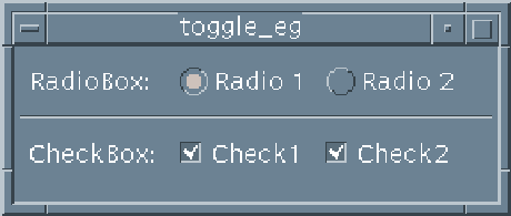
Figure 6.3: A Label Widget
- PushButton
- -- A button that can be labelled with a
String (Fig 5.1). We have already met this widget in our first
program, push.c (Chapter 5).
- DrawnButton
- -- A button with which an icon (Pixmap) can be
associated (Fig. 6.4).

Figure 6.4: A DrawnButton Widget
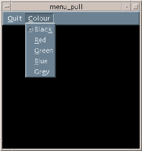
- CascadeButton
- -- A button usually associated with a
PullDown menu (Fig. 9.2). This widget is described in association
with PullDown menu widgets in Chapter 9.

Figure 6.5: A CascadeButton Widget and Associated PullDown Menu
- ToggleButton
- -- A button that displays text or graphics
together with a graphic indicator of the state of the ToggleButton. The
ToggleButton has two states: either on or off. Toggle buttons may be
grouped together to provide a variety of configurations.
RadioBox are groups of
ToggleButtons, where only one button can be selected at a time. A
CheckBox , on the other hand,
allows any number of buttons to be selected at a given time
(Fig. 6.6). Examples of both configurations of ToggleButton are
given in Chapter 15.

Figure 6.6: A RadioBox and CheckBox ToggleButton Widget Configuration
- Scrollbar
- -- A widget that allows the contents of a window
to be displayed in a reduced area where the user can scroll the window to
view hidden parts of the window. This widget can be defined and used explicitly
in Motif programs (Chapter 14). Frequently, scrolling control
will be defined when the ScrollBar (Fig. 6.7) is
compounded with another widget. Chapters 11 and
17 discuss examples of the Scrollbar used in conjunction
with Text (Fig. 6.10) and DrawingArea widgets respectively.

Figure 6.7: A Scrollbar Widget
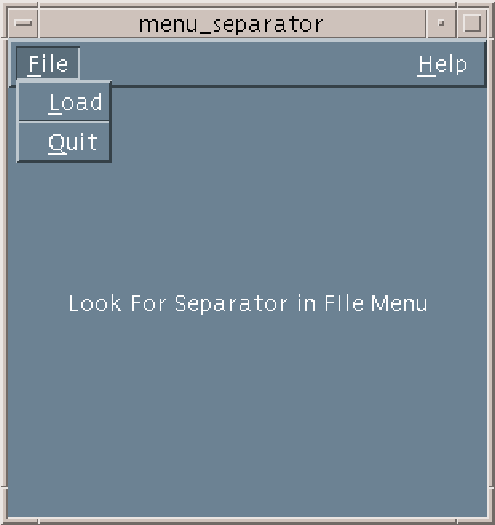
- Separator
- -- A widget used to separate items in a GUI to
aid visual display. Fig. 6.8 illustrates the use of the
Separator widget to delineate items (Load and Quit) in a single
pulldown menu.

Figure 6.8: A Separator Widget Between Two Menu Items
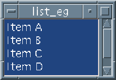
- List
- -- A widget that allows selection from a list of
text items (Fig. 6.9). This widget is described in
Chapter 12.
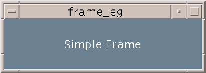
Figure 6.9: A List Widget
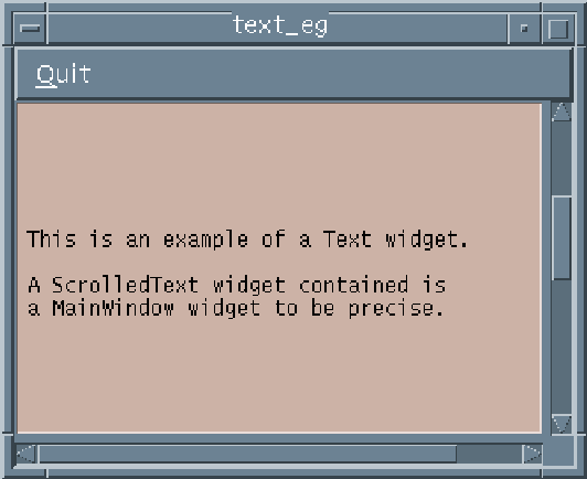
- Text
- -- A complete text editor widget
(Fig. 6.10). This widget provides default callback resources for
text selection, editing, cutting and pasting of text as well the editing style
of the widget. Additional callback resources can easily be attached to extend
and customise the text widget for many text editing applications.
Chapter 11 addresses all such issues.
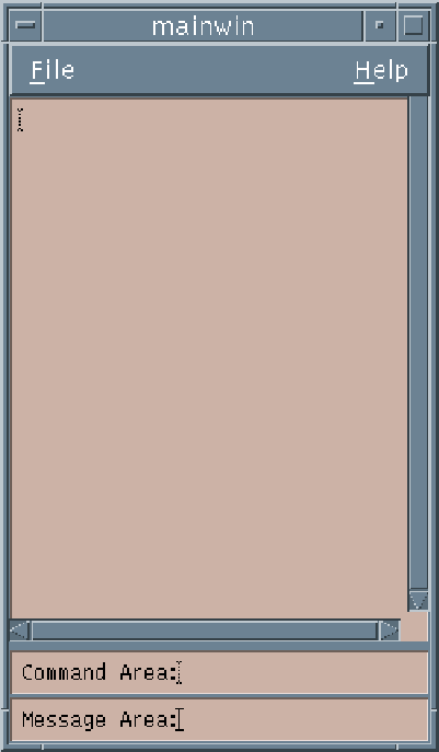
Figure 6.10: A Text Widget
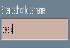
- TextField
- -- A
single-line text editor. This is basically a Text widget which is limited to a
single-line of text entry. The TextField widget has many uses in GUI design
where simple input is required. For example, when a file name needs to specified
as input in a GUI or a key word is required for some search.

Figure 6.11: A TextField Widget
Motif 2.0 also prescribes another form of text widget,
CSText . This widget provides
the same facilities a the Text widget but uses an alternative (compound) text
string representation, XmString (Section 6.6), which is
capable of supporting multiple fonts .
There may be occasions in Motif programming
when we want to have the properties of a primitive widget but do not wish to
worry about the management of the window properties of the widget. Motif has to
manage each created widget's window and associated resources. If we have several
widgets within our interface this could cause complications for our application.
To attempt to alleviate many of these problems Motif provides
Gadgets . Gadgets are basically windowless widgets and,
therefore, require less resources than a widget. Control of the gadget is the
responsibility of the parent of the gadget.
Not all widgets have corresponding gadgets. The following gadgets are available:
ArrowButton, Label and Separator. They behave in a similar manner to
their corresponding widgets.
We will not consider gadgets further in this book since our programs are
relatively simple and the relevance of their use cannot be effectively
illustrated. The primary use of gadgets is when there is a real need to
save memory on the X server or within the application. Gadgets may actually
increase computer processor load since X finds some events more difficult to
track within them. Gadgets are basically an artefact from earlier versions of
Motif that were developed when window construction and management was more
critical. Later versions of X have optimised the X server and coupled with the
fact that computer power has increased and memory is less expensive, the use of
gadgets is not as important as it once used to be.
Manager widgets are the basic Motif widgets for constructing and organising
our interfaces in Motif. The following manager widget classes are
available:
- Frame
- -- A widget that provides
an embossed effect to the child widget it contains (Fig 6.4).
This is the simplest manager widget. An example of this widget is given in
frame.c (see Exercise 6.1).
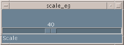
Figure 6.12: A Frame Widget
- ScrolledWindow
-
-- A widget that allows scrolling of its child widget. Fig. 6.10
illustrates a common example of this: a ScrolledText widget that has a Text
widget capable of being scrolled in a horizontal and vertical direction.
One
common subclass of the ScrolledWindow widget is the MainWindow widget:
- MainWindow
- -- A typical
top level container widget for an application. This widget provides a common, uniform
look and feel for any GUI (similar to MS Windows look and feel
(Section 3.1)). The MainWindow widget has well defined mechanisms for
the provision of Menubars, Scrollbars and command and message windows
(Fig. 6.13). Chapter 9 describes the major aspects
of MainWindow programming.

Figure 6.13: A MainWindow Widget
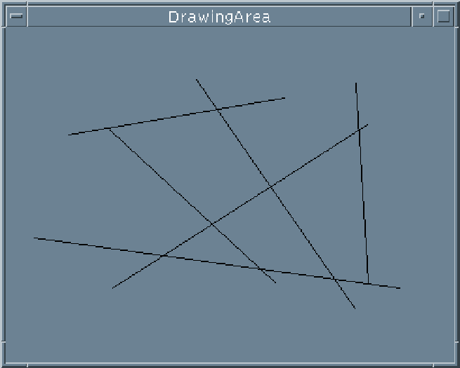
- DrawingArea
- -- A
widget where graphics can be displayed (Fig. 6.14). Note:
Motif does not provide any graphics functions, Xlib provides all the graphic
drawing and manipulation routines. Graphic programming and the interface with
Xlib is one of the more difficult aspects of Motif to understand.
Chapters 16--18 discuss these more advanced issues of
programming and show how the DrawingArea widget is used in practice.

Figure 6.14: A DrawingArea Widget
- PanedWindow
- -- Allows
vertical tiling of child widgets. The use of this widget is not as common as
other widgets and we will not address its use on this particular
journey through Motif.
- Scale
- -- This widget provides a
slider object that can be used for user input (Fig. 6.4).
Chapter 13 describes the Scale widget.
Figure 6.15: A Scale Widget
- RowColumn
- -- A widely
used widget that can lay out widgets in an orderly 2D fashion.
Chapter 8 describes this widget.
- BulletinBoard
- --
There are two sub-classes of this widget:
- Form
- -- A widget similar in use to
RowColumn but allows greater control of the placement and sizing of
widgets. Chapter 8 compares and contrasts the Form and RowColumn
widgets.
- Dialog
- -- There are
two forms of dialog:
- a MessageBox which simply gives information to the user
(Fig. 6.16) and
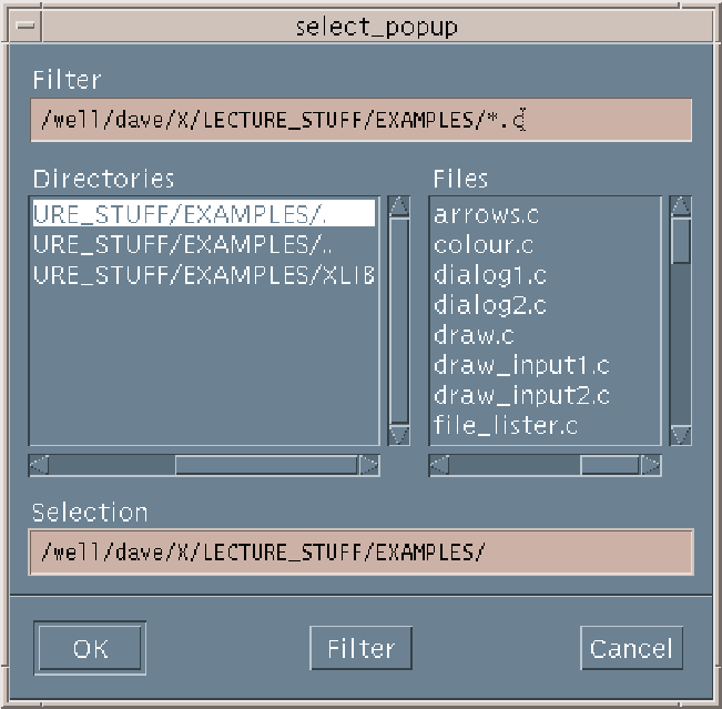
- a SelectionBox
which allows interaction with the user. Motif provides two sub-classes of the
SelectionBox widget: a Command widget for command line type input and a
FileSelectionBox
for directory/file selection (Fig. 6.17).

Figure 6.16: A MessageBox (ErrorDialog) Widget

Figure 6.17: A FileSelectionBox Widget
Dialog widgets, as the name implies, provide the direct line of communication
between the user and the application. In the case of the
MessageBox widgets this could simply be the program informing the user of
some event or action. There are several prescribed classes of MessageBox
widgets that are associated with a special event. For example there are
WarningDialog, InformationDialog and ErrorDialog widgets
(Fig. 6.16). Also some form of prescribed user
interaction is provided by the Command and FileSelectionBox widgets.
Motif also provides base MessageBox and SelectionBox widgets so that
the programmer can assemble customised Dialogs. However, Motif programming style
(Chapter 20) suggests that wherever appropriate the prescribed
Dialog widgets should be used to provide uniformity across applications.
Chapter 10 deals with many aspects of Dialog widget programming and
usage.
Motif 2.0 defines a few new Manager widgets:
- ComboBox
- -- A widget that
combines the capabilities of a single line
TextField and an XList.
- IconGadget
- -- A widget
that can be used to display Icons.
- Container
- -- A widget
that manages IconGadget children.
- Notebook
- -- A widget that
organizes children into pages, tabs, status area and page scroller.
- Scale (thermometer)
- -- A
modified version of the Scale widget with new resources added for thermometer
behavior (see Chapter 13).
- SpinBox
- -- A widget that
manages multiple traversable children.
The use of many of these new widgets is fairly advanced and, except where
indicated, these widgets are not dealt with further in this introductory text.
Chapter 21 gives some further details on Motif 2.0.
Each widget has a number of resources. These control many features of the
widget such as the foreground and background colours, size etc.. A
particular widget will have specialised resources such as callback resources
which define how the widget responds to an event etc..
Every widget is documented in the Motif Reference Manual ([Hel94b]) which
gives a complete list of the resources that a particular widget employs. When
discussing individual widgets we will only consider the important resources that
define the main characteristics of the widget concerned. The following Chapter
addresses how widget resources can be set and altered for a given application.
There is a hierarchy of widgets (Fig 6.1) and a
widget will
inherit resources from a higher resource class in the widget
hierarchy.
The levels of the hierarchy and related widget resources are:
- Core
- -- This
superclass gives background, size and position resources that are common to all
widgets.
- XmPrimitive
- -- The superclass of all primitive widgets defines
resources related areas such as foreground and highlight colour.
- Composite
- -- The superclass of containers for widgets has two
sub-classes:
- Shell
- widgets have resources related to interfacing with
the window manager.
- Constraint
- widgets have resources that are concerned with the
positioning and alignment of widgets contained within.
XmManager is a subclass of constraint and specifies general
manager widget resources such as callbacks and highlight colour.
- Widget level
- -- Resources particular to a specific widget.
Motif programs (in C/C++) will typically need to use both types of
string available:
- A data type String -- A
``normal'' C string (an array of characters). However, for convenience Motif has
defined String as a standard Motif Data Type. Clearly, as Motif
programs are usually written in C, this data type will be the main means of
communication between a program and the standard input and output mechanisms.
- A data type XmString -- Motif internal
string data structure. When Motif needs to draw strings on the display,
to achieve this more information is needed than simply the array of
characters. Consequently, Motif defines an
XmString with a more complicated structure. Most widgets can have a label
resource associated with them, which is usually an XmString data type. It is
rarely that the Motif programmer will need to know the internal structure
of an XmString.
Motif provides a number of functions to convert a String into an
XmString or vice versa:
XmStringCreateLocalized(),XmStringCreateLtoR(), XmStringGetLtoR(),
XmStringCompare(), XmStringConcat(), XmStringCopy(), etc. are common
examples. Many behave in a similar manner to their C standard library string
handling function counterparts.
Their use is fairly straightforward -- the reference manuals should be consulted
for more details.
NEED SOME MORE


Next: Widget Resources
Up: X WIndow/Motif Programming
Previous: A First Motif Program
dave@cs.cf.ac.uk

