- Start a New movie: File > New > Movie (Shortcut = Command+N)
- Choose Modify > Movie > Properties. In stage size, choose 640 x 480.
- Choose Window > Vector Shape (Shortcut =
Command+Shift+V)

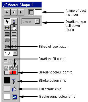
Macromedia Director Vector Shape Window
- Click the filled ellipse button.
- Draw an ellipse (circle) about the size of the Vector Shape Window - don't worry about being exact, we will be changing the size of it later.
- Click on the Gradient fill button. This fills the ellipse with the default colours, which happen to be a light grey to red (unless someone has changed it on your computer).
- To change the colours, click the colour box on the left side of the Gradient colour control and choose a sky blue from the colour menu. You will notice the Fill colour chip changes too. Change the colour on the right side of the Gradient Colours to a dark blue.
- Change the Gradient type pull-down menu at the top of your window from Linear to Radial.
- Change the Stroke Colour to white - notice how the outline of the ellipse disappears.
- Close the Vector Shape window.
- In the Cast Window, select the ellipse. Choose Edit > Duplicate (Shortcut = Command+D). A copy of the cast member is produced in the next available cast slot. Double click the new cast, which opens it in the Vector Shape Tool.
- Change the Cycles to 3 and the Spread to 200. Click the Previous Cast button and compare the 2 ellipses. Experiment with different cycles and spreads to get an idea of what they mean.
- Name the latest ellipse to 'bouncing ball' - this can either be done at in the Vector Shape window or the Cast Member Window.
- Drag 'bouncing ball' from the cast member window to the stage. You could drag and drop it straight into the score, which would automatically centre it on the stage.
- You will notice the sprite (the object that appears in the score) is extended over 20 frames. This is a default setting that we can change. Drag the right end of the sprite to frame 40.
- Click anywhere in the middle of the sprite to select it. We are now going to resize the ellipse. Click on the top of the stage window to make it active. Press Shift and while still holding down, click on a corner handle of the spite and drag it in to make it smaller. Holding down Shift lets us resize the object in proportion to its original dimensions. Resize the sprite to approximately the size shown in diagram 2, and move it to the left side of the stage.
- Click on frame 40 in channel 1 (the end of the sprite), hold down Option and shift and drag the ellipse to the right end of the stage. (Holding down shift restricts the movement to 90 degrees). With Option selected You will notice a line being drawn on the stage - this is the animation path. Rewind and play the movie to see what you made.
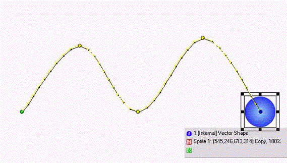
- To curve the path, we are going to insert keyframes within the sprite. Click on frame 10 of the sprite and choose Insert > Keyframe (Shortcut = Command+Option+K) Create keyframes at frame 20 and 30.
- You will notice at each keyframe, a circle appears on the path shown on the stage. Click
on the keyframe 10 circle and drag
it up.
Do the same with keyframe 30, producing a path similar to that shown below. Rewind and play the
movie.

Curving the Ball's Path